
Adobe has started rolling out new icons for each of its 50+ apps in a major refresh for the whole brand. In a blog post, Adobe announced a new logo and redesigned app icons in a move that will change the company’s branding.
The Adobe logo, which has been the same since 1993, will change to become a single-colour, warmer red trademark for the tech firm. They said that this will “[ensure] the mark is as functional as possible at all sizes and across all surfaces”.
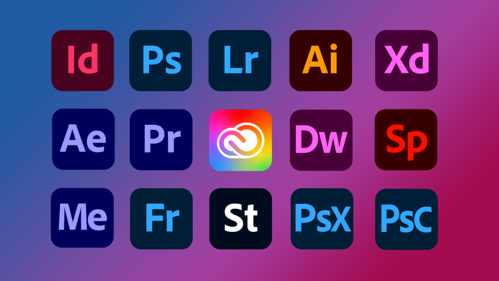
Each one of Adobe’s specialist apps, like Photoshop, Lightroom and Premier Pro, will be receiving a revamped logo too. All product logos will have rounded corners and will ditch the border that was present on previous variations. The most significant change, however, will be the unification of colours.
Before this change, each app had a different colour scheme in the icon. Now, apps will be grouped by category – such as Video & Motion or Photography. Adobe says this will “ensure customers can easily find the products they need” and will be optimised for accessibility, too.
Author’s Opinion: this change is much-needed and makes sense from an accessibility and marketing perspective. The colours are certainly more dull but it will unify the Adobe suite of apps and make them consistent on each platform.
Creative Cloud’s branding has also been refreshed from the classic red to a mix of all colours, producing a rainbow gradient effect. Adobe has increased the weight and legibility of the icon to go with this.
The changes are rolling out now and should be present on Adobe’s website, in Creative Cloud and on social media platforms.

I like 👀