
Google has unexpectedly rebranded G Suite as Google Workspace, a one-stop location for all of the tech giant’s productivity apps. Google Workspace includes and connects Gmail, Calendar, Drive, Docs, Sheets, Slides, Meet, and more apps. With this new update, a few of the apps will get new four-color icons in the coming weeks, well representing the Google style.
Here are the new icons:
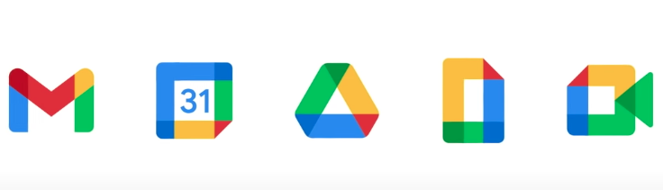
The envelope is not prominent in the Gmail logo anymore, but the M is certainly shaped that way. Now, one bad thing here is that the icons can get really confusing at a glance and will take time to get used to. Being all in the same color palette, the shapes don’t really stand out much.
Still, the red color dominates in the Gmail logo, which used to be the primary color even in the old logo. The Google Drive logo hasn’t been changed much, other than making its edges a little more softer. Google Meet looks different too, yet keeping its green prominent. Sheets and Calendar have also gone through a revamp.
One thing to notice here is that Google has kept the original colors of its apps in the new icons more noticeable and covering a large area as well, as in Sheets, making yellow stand out, in Calendar, making blue stand out, and so on.
Along with the new icons the update also introduces a variety of new collaboration features. In the coming months, Google Workspace will also offer ways for users to do things like manage a family budget, set up a neighbourhood group, and more, using integrated tools.
