
I use Pixelmator on a daily basis and whilst it’s a brilliant app there are large annoyances I have to deal with. In making this concept, I used the original app for inspiration, and all features are effectively the same as what’s in Pixelmator now.
The UI has a much-needed Light and Dark theme. Currently, the app uses a mix of both. Built from the ground up, the interface is either all dark grey, or all white. The toolbar, at the top, is flexible, and re-organised in two, with select buttons appearing when needed. A simple right swipe draws out the new Layer Panel, with a Force Touch on a layer expanding more options.
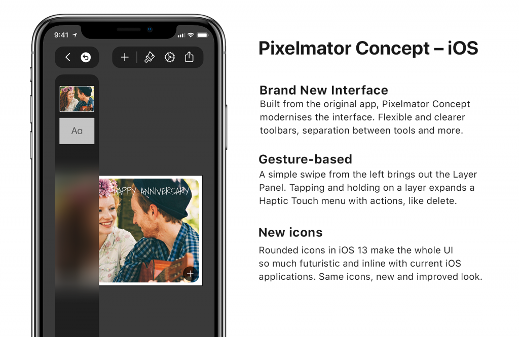

All icons are based on Apple’s iOS 13 SF Symbols, making it fit in better with iOS and giving it a fresh look. Menus have been reimagined so they are more accessible and easier to navigate – you can now swipe down on a menu to dismiss it. It will no longer appear full screen.
Sharing it better than before. A more modern and interactive view lets you choose an action and carry it out – such as exporting to a PNG. Again, coloured icons make this a much more visual-focused experience. Quick Actions in this menu let you quickly copy the art-board to your clipboard, delete the file, or create a duplicate.
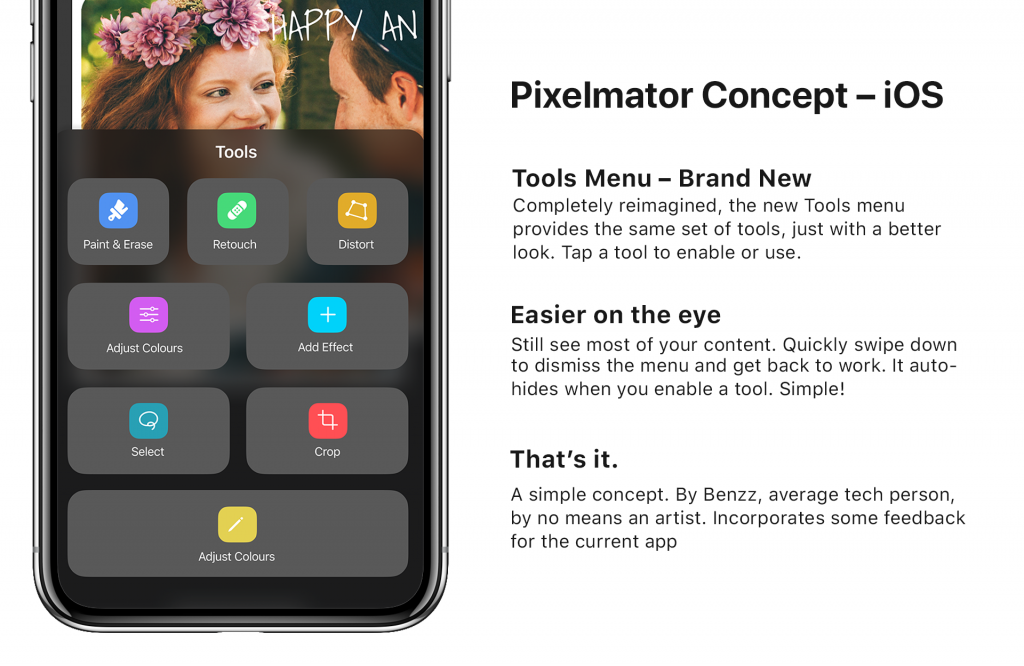
Tools: completely revamped. Fitting in with the new design, the menu uses large buttons that means tapping on one simply activates the feature (such as Paint, or Distort). An added touch of colour make it easier to look for the option you need. All in one menu.
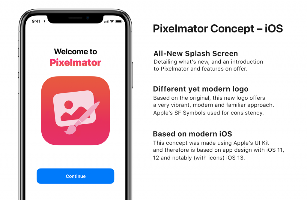
Final touch: the refined and new app icon!
This is a concept made by Apple TLD’s Ben Ward. Please give credit upon use.
